
A mobile app designed to enhance street safety, empowering people to walk without fear.

Overview
Background
This case study represents the final project for my Master’s dissertation in Interaction Design and User Experience Design at the UOC. For this project, I aimed to study people's perceptions of safety and street harassment, with the goal of finding a solution to help individuals feel safer in public spaces.
The problem
Many people around the world experience insecurity in their daily lives, particularly on the streets. Women are especially vulnerable, often facing situations of street harassment and sexual violence. Children are another group at risk, as their limited visual field and cognitive capacity make it harder for them to recognise potential dangers.
The goal
Create a tool with a series of features that empower vulnerable individuals to walk the street without fear. This would enable them to travel with greater freedom and independence.
Role
UX Research
Prototyping
User Testing
Tools
Figma
Optimal Workshop
Miro
Research
Desk research
To gain deeper insights into the topic of this project, I decided to conduct desk research. This research method allowed me to consult various sources and better understand the challenges that women and children face when walking alone on the streets. I felt it was necessary to first define a series of questions to guide the direction of the research process.
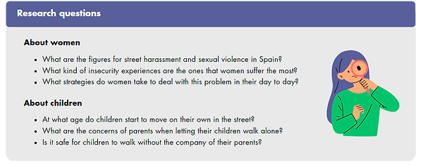
Example of some of the research questions I used to guide the research process.
The main insight from the research was that sexual harassment is a major reason why women feel unsafe in public spaces. Unfortunately, it is a frequent issue in many women’s lives, leading some to normalise these experiences. Regarding children, Spain can be considered a relatively safe country where parents may confidently allow their children to walk to school alone, provided the children have been properly trained to do so.
Benchmarking
For the research stage, I also set up a benchmarking study. In this case I analysed six street safety apps: Becon, bSafe, WalkSafe, Life360, FindMyKids and BeCloser. This analysis allowed me to assess the characteristics and functionalities of each app, as well as identify their strengths and weaknesses.

Benchmarking table comparing six street safety apps, organized into five sections: scope of action, goals, functionalities, other app features, and technical and design characteristics. The content was written in Spanish.
Interviews
I carried out five interviews to gain a deeper understanding of potential users and their perspectives on street safety. The goal was to uncover details about their behaviours, concerns, and needs related to feeling safe in public spaces. I interviewed two user groups: women and parents of children. I chose not to interview children directly due to the complexities involved (difficulties in the development of an interview, use of their data, etc.)
Affinity diagram
The interviews provided a wealth of information, so I used an affinity diagram to organise and analyse the data. This technique allowed me to categorise the data into groups based on similar themes. You can view the detailed diagram here (in Spanish).
Key insights
-
Women frequently feel unsafe, particularly when coming home alone early in the morning or at night. This sense of insecurity is heightened in less populated and unfamiliar areas.
-
All participants had firsthand experience with danger and are highly aware of the issue. As a result, they have developed various strategies to maximise their sense of safety.
-
The parents interviewed expressed concern about their children’s safety when they are out alone. This concern varies depending on the parent's personality, the child's age, and the child's behaviour.
-
Geolocation apps are not widely used, and many people are unaware of their existence. Nonetheless, the interviewees who were unfamiliar with these apps showed interest in using them.
Definition
Personas
I began the definition phase by creating two user personas, incorporating key insights from the interviews. Each persona includes a detailed biography, along with their goals, needs, frustrations, demographic characteristics, personality traits, and technology use. Below is a brief summary of these two user personas.

Rebeca
Rebeca, originally from a small town in southern Spain, recently relocated to Madrid to pursue a degree in Economics. Her life is now busy with studying, socialising with friends, and visiting the gym daily. While she enjoys her new city, she misses her hometown and wishes to stay closely connected with her family, boyfriend, and old friends. She also hopes to become a local in Madrid, but she is concerned about not feeling as safe as she did in her hometown.

Magdalena
Magdalena is happily married and has two children: a 12-year-old daughter and an 11-year-old son. She works as an accountant but enjoys painting in her spare time. Her primary goals are to spend quality time with her family and to ensure her children have a safe environment while also providing them with more freedom and independence.
User journeys
After creating the personas, I made four user journey maps to illustrate how users interact with the product. Each map details the users' actions and goals, touchpoints and pain points, as well as their emotions and opportunities for improvement.

Example of a user journey map. In this scenario, the user creates a group on the app to share her location with her friends.
Design
Information architecture
After completing the research and definition phases, I moved on to generating solutions. My first step was to develop the app's information architecture. In order to so, I started creating a comprehensive list of all the content to be included in the app, focusing specifically on the functionalities the app would offer.
Card sorting
I carried out a card sorting exercise to understand the mental models of potential app users. This helped me see how they perceive the information and categorise the different types of content. The study included 25 items and involved five participants. After analysing their responses, I organised the content into four groups: Safe Walk, Explore, Your Connections, and Your Account.
Tree testing
In order to evaluate the effectiveness of the content structure, I conducted a tree testing study. I prepared four tasks and I invited five people to participate. Each task involved a fictional scenario where the participants had to complete specific actions using the app. Instead of navigating through a prototype, participants explored the content directly. The results of this study allowed me to refine the initial information architecture by adjusting labels and reorganising content. The final structure was revised and it included five groups: Safe Walk, Area Safety, Your Connections, Your Account, and Support & Settings.
User flows
Next, I created user flows to visually represent the app's navigation. These diagrams illustrate how users interact with the product while performing specific tasks.
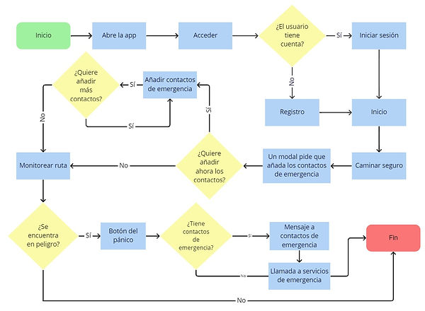
Example of a user flow. In this scenario, the user opens the app for the first time and is prompted to add their emergency contacts. Depending on whether the user has added their contacts or not, different actions will be triggered when the panic button is pressed.
Sketches
The first stage in the prototyping process involved sketching. I started drawing sketches of some of the screens that would be part of the app, focusing on those included in the user flows.

Sketches of several app screens: Safe Walk, Emergency Contacts, Emergency Button, Your Connections, Add Friends, and Create Group.
Wireframes
The second stage of the prototyping phase involved creating wireframes. The idea was to quickly design a prototype that represented the app’s functionality without focusing on graphic details.
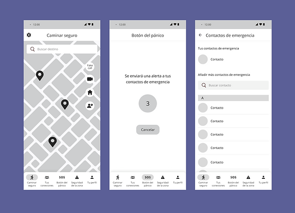
Some screens from the low-fidelity prototype of the app: Safe Walk, Emergency Button, and Emergency Contacts.
High-fidelity prototype
The final step in the prototyping phase was creating the high-fidelity prototype using Figma. I incorporated colours, fonts, and images to produce a polished and finished product.
Safe walk
The Safe walk tab is the first screen users encounter upon logging in. Here, users can enter their destination and start tracking their route. The app will start monitoring the journey; if the user deviates from their path, loses connection, or starts running, an alert is automatically sent to their emergency contacts.


Emergency contacts
The Safe walk tab includes a button for users to add their emergency contacts. If the user finds themselves in a potentially dangerous situation and press the button, the app will send a message with their location to these contacts.


Your connections
The Connections tab features a map displaying the locations of the user's friends. Below the map, users can view a list of their added friends and groups. Additionally, the app enables users to communicate with their friends via chat and video calls.


Area safety
The Area safety tab displays incidents reported by other users of the app. Depending on the severity of the incident, these are classified into three colors: red, orange and yellow. Tapping on an incident reveals more details as well. Users can also report their own incidents and provide updates on the safety of specific areas.


Emergency button
If the user is in danger, they can press the emergency button. A three-second countdown will then begin, after which an alert is immediately sent to their emergency contacts. Additionally, the user will be prompted to call emergency services.


Evaluation
Heuristic evaluation
I conducted a heuristic evaluation to test the usability of the prototype. This technique involves analysing an interface based on established principles. For this evaluation, I followed Jakob Nielsen's heuristic principles.
Problems found:
-
There are no confirmation windows, which could be useful before performing a task (e.g. adding a friend) or after cancelling a task (e.g. dismissing a form).
-
Error messages haven't been designed to inform the user in the event of an error.
-
It would be desirable to provide more guidance through contextual messages to help users utilise the less intuitive tools.
-
Buttons do not have different states, so users won't have the certainty they have pressed them.
-
The "X" button on the forms does not effectively convey the idea of canceling, since it typically represents closing rather than canceling.
-
Not all buttons share the same design. It would be desirable that the elements had the same design to achieve greater internal consistency.
Solutions & changes in the prototype:
-
I included coach marks to indicate the functionality of the less intuitive tools.
-
I created error messages to inform users of problems and help them recover.
-
I added two states for the buttons: the default state and the pressed state. This provides users with clearer feedback on their actions.
-
Confirmation windows have been included on the app.
-
The "X" button was not replaced with the text "Cancel" in the forms due to space constraints. However, by including confirmation windows before cancelling a task, users will know that the task is about to be discarded.
User testing
The second part of the evaluation stage involved carrying out a usability test. It was important to involve users in the evaluation to observe their actual interaction with the product. The test included five participants whose profiles matched the target user demographic. I prepared four tasks for them to complete using the prototype, aiming to gather insights into their experience and identify areas for improvement.
Problems found:
-
The app does not allow users to search for a location and save it as a favourite.
-
It was not apparent to some participants that in order to activate the safe walking mode they first had to search for a destination.
Solutions & changes in the prototype:
-
I added a button to save a location after searching for a destination. When the user saves a location, they are directed to a screen where they can either enter a name for the location or choose from preset options like "Home" or "Work."
-
I updated the Safe walk screen to highlight the route-tracking functionality. I also added brief instructions to help users better understand this functionality. Additionally, I included a button allowing users to monitor their route without setting a specific destination.